Maximizing User Experience – Designing Intuitive Navigation for Your Website
It’s necessary to design your website with intuitive navigation to enhance user experience. By understanding how users interact with your site, you can create clear pathways that guide them effortlessly through your content. Effective navigation not only keeps visitors engaged but also encourages them to explore more of what your site has to offer. In this post, you’ll discover practical strategies to streamline navigation, making it easier for users to find what they need while boosting your website’s overall effectiveness.
Understanding User Experience
Your website’s effectiveness hinges on user experience (UX), which encompasses every interaction users have with your platform. Well-designed UX fosters engagement, encourages retention, and increases conversion rates. Through careful observation and analysis of user behaviors, you can tailor navigation and features to align with their needs, ensuring a seamless journey through your content.
Importance of User Experience
Investing in user experience significantly influences how visitors perceive your brand. A positive UX not only retains customers but also converts casual visitors into loyal users. Statistics indicate that a site designed with user experience in mind can boost conversion rates by up to 400%, underscoring the direct link between UX and business success.
Key Principles of User-Centered Design
Designing with users at the forefront involves several key principles: empathy, usability, accessibility, and iterative testing. Empathy ensures you understand user needs and pain points, while usability focuses on creating intuitive interfaces. Accessibility guarantees that your site is usable by individuals with diverse abilities, and iterative testing provides ongoing insights to continuously refine the user experience.
Empathy drives the design process, compelling you to observe and engage with your target audience to grasp their specific needs and preferences fully. Usability prioritizes how easily users can navigate your site, advocating for simple layouts and clear call-to-action buttons. Accessibility ensures that users with disabilities can engage with your site, involving practices such as alt text for images and keyboard navigation options. Iterative testing involves actively seeking user feedback and making adjustments based on their interactions, which leads to a product that resonates with their expectations. Each principle integrates to form a cohesive, responsive design strategy that enhances your website’s effectiveness.
The Psychology of Navigation
Users’ interactions with your website are deeply influenced by psychological principles, particularly in how they navigate. Effective navigation isn’t just about aesthetics; it relies on understanding cognitive processes and user behavior. Your design should reflect how users think and act, promoting an effortless experience that aligns with their expectations. When navigation feels intuitive, users engage more, leading to better satisfaction and retention rates.
Mental Models and User Expectations
Mental models shape how users perceive and predict the structure of your website. These models represent their internal understanding of how things function based on past experiences. Users expect familiar layouts and features, allowing them to navigate seamlessly. By aligning your navigation with these mental models, you reduce cognitive load, enabling users to find information quickly and intuitively.
Common Navigation Patterns
Utilizing common navigation patterns helps guide users through your site effectively. These patterns, such as top horizontal menus, sidebar navigation, and breadcrumb trails, create familiarity, enhancing usability. By implementing these conventional structures, you reassure users, allowing them to focus on content rather than troubleshooting navigation barriers.
Top horizontal menus are widely recognized and provide a clear view of site sections, reducing any confusion. Sidebar navigation offers additional context, great for deeper hierarchies or related content. Breadcrumb trails keep users oriented, especially on large sites, making it easy to backtrack. Adopting these patterns not only meets user expectations but also allows for more efficient browsing, ultimately improving overall user satisfaction. Over 70% of users report higher satisfaction when using familiar navigation structures, which highlights the importance of these common patterns in design.
Designing Intuitive Navigation
Effective navigation design positions vital information at users’ fingertips, creating an effortless browsing experience. By emphasizing clarity and accessibility, you enable visitors to locate what they need without frustration. Structuring your navigation thoughtfully ensures that users can traverse your website with confidence, enhancing their overall satisfaction and encouraging prolonged engagement.
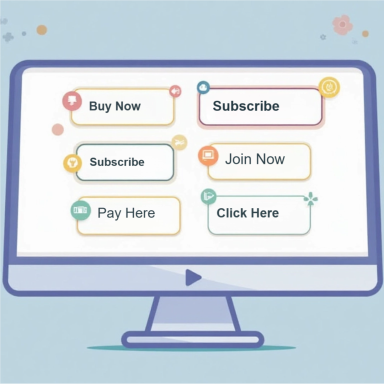
Simplifying Menu Structures
A streamlined menu structure minimizes cognitive load and facilitates quicker decision-making. Limit primary menu items to five to seven core options, ensuring that each label is clear and descriptive. Categories should be intuitive, guiding users naturally to subcategories. By avoiding unnecessary complexity, you enhance usability, allowing visitors to find content swiftly.
Utilizing Visual Hierarchies
Implementing visual hierarchies is fundamental in guiding users’ attention effectively. Use contrasting colors, font sizes, and spacing to differentiate menu items and highlight key links. Organize information in a way that naturally leads the eye towards important areas, such as calls to action or new content. Research shows that users are more likely to engage with designs that clearly prioritize information, improving overall navigation efficiency.
Visual hierarchies can be enhanced by incorporating techniques like bold typography for primary navigation links and lighter text for secondary options. Space between elements also plays a role; adequate padding can create a sense of separation and clarity. Consider studies from websites like Smashing Magazine, where altered visual hierarchies led to a 20% increase in user engagement. Pay attention to how elements are arranged within your design, as this will greatly influence user behavior and satisfaction.
Accessibility Considerations
Addressing accessibility ensures your website can be navigated and understood by all users, including those with disabilities. Incorporating features like keyboard navigation, screen reader compatibility, and proper color contrast elevates user experience for everyone. Laws such as the Americans with Disabilities Act (ADA) mandate accessibility, underscoring its significance. Failure to consider these factors can lead to frustrated users and potential legal ramifications, so prioritizing accessibility is not only ethical but also beneficial for your website’s reach.
Designing for All Users
Creating an inclusive website means designing for various abilities and preferences. Use clear language, provide alternative text for images, and enable adjustable font sizes. Ensuring your navigation is intuitive and linear assists users with cognitive disabilities. Implementing ARIA (Accessible Rich Internet Applications) roles and properties can also help assistive technologies interpret your content effectively, allowing all users to enjoy a seamless experience.
Tools for Testing Accessibility
Utilizing testing tools streamlines the process of ensuring accessibility in your design. Products like WAVE, Axe, and Lighthouse provide insights into potential improvements, scoring your site’s accessibility performance against established guidelines. Identifying issues early on allows for timely adjustments, fostering a more inclusive user experience.
Tools like WAVE will scan your web pages and highlight areas for improvement, offering detailed reports on accessibility issues such as missing alt text, contrast errors, and structural problems affecting screen reader users. Axe can integrate directly into your development workflow, providing real-time feedback as you build. Lighthouse, available in Chrome DevTools, assesses your site’s quality across multiple metrics, including accessibility, optimizing your design based on industry standards. Regularly using these tools during development ensures compliance and enhances the usability of your site for all visitors.
Mobile Navigation Strategies
Designing effective mobile navigation requires a strategic approach tailored to smaller screens and touch interactions. You should prioritize simplicity and accessibility, ensuring users can easily locate imperative information without unnecessary distractions. Utilizing collapsible menus and clear icons enhances usability, allowing users to engage with your content effortlessly. Testing your design across various devices helps you identify and resolve any navigation issues, ensuring a seamless experience for all users.
Responsive Design Principles
Responsive design ensures your website adapts fluidly to different screen sizes and orientations. By employing flexible layouts, scalable images, and CSS media queries, you create an optimal viewing experience that maintains user engagement. Prioritizing legibility and ease of navigation in your design allows users to interact with your website comfortably, regardless of the device they use.
Mobile-First Navigation Techniques
Mobile-first navigation techniques focus on designing for smaller screens before scaling up to larger devices. This approach encourages you to streamline navigation elements and prioritize imperative features, improving user experience on mobile. Creating a single-column layout, using thumb-friendly touch targets, and incorporating gesture-based interactions contribute to enhanced usability in mobile environments.
Implementing mobile-first navigation techniques means starting with a lean design that emphasizes key functionalities. You can use a hamburger menu to declutter the screen while allowing access to secondary pages. Prioritizing vertical layouts caters to thumb movement, which studies indicate is the natural behavior for most users. Additionally, integrating touch gestures can make navigation feel more intuitive; for example, swiping left or right for browsing can enhance engagement. This focus on simplicity and efficiency resonates with users, ultimately driving higher satisfaction and increased retention rates.
Testing and Iterating on Navigation
Effective navigation is not a one-time setup; it requires ongoing testing and iteration. Prototyping your navigation design and seeking regular feedback allows you to track user behavior, identify hurdles, and refine elements to enhance usability. Implementing a cycle of testing and updates ensures that your website’s navigation evolves based on authentic user experiences and expectations.
User Testing Methods
User testing can take various forms, including A/B testing, usability tests, and remote testing sessions. By conducting these evaluations, you gain qualitative insights into how real users interact with your navigation. Observing users as they navigate your site helps highlight pain points and areas where confusion often arises, allowing for focused improvements.
Analyzing Feedback for Improvements
Collecting feedback from user testing is just as vital as the testing process itself. Focus on both qualitative comments and quantitative metrics like task success rate. Understanding where users struggle can guide you in tweaking navigation elements to align better with user expectations and behaviors.
Analyzing feedback involves transforming data into actionable insights. For instance, if users frequently mention confusion during checkout, consider simplifying that pathway or refining labels to enhance clarity. Reviewing heatmaps and session recordings can additionally illustrate where users hesitate, click, or drop off. By segmenting feedback into specific issues, you can prioritize changes that yield the most significant impact on user experience. Regularly revisiting this feedback loop ensures your navigation remains intuitive and efficient.
Final Words
Following this guide, you can significantly enhance your website’s user experience by implementing intuitive navigation. By prioritizing clarity and simplicity, you ensure that visitors can easily find the information they seek, leading to increased engagement and satisfaction. Evaluate your current navigation structure, gather feedback, and make iterative improvements to meet your users’ needs. As you refine this aspect of your design, your website will not only attract more visitors but also encourage them to return.