
Many designers overlook key steps that ensure artwork prints correctly at scale. You need precise file settings, proper color modes, and correct bleed and margins. Follow these proven steps to deliver professional, print-ready files that meet industry standards and avoid costly production delays.
Selecting Professional Color Spaces
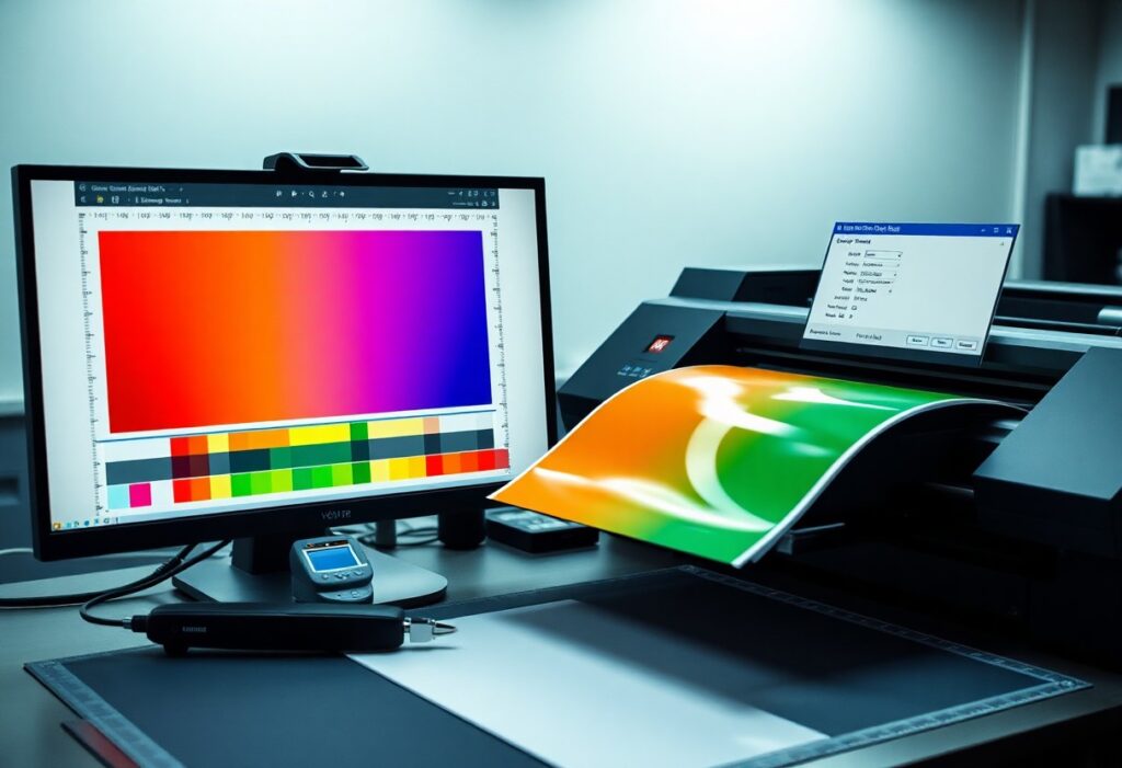
Choosing the correct color space ensures your artwork translates accurately from screen to print. For commercial production, CMYK is the standard, as it aligns with four-color process printing. Working in RGB during design is common, but converting too late can cause unexpected shifts in tone and saturation.
Factors for converting RGB to CMYK for print accuracy
- Convert early in the design process to catch color shifts promptly
- Use the correct ICC profile matching your print provider’s equipment
- Manually adjust colors post-conversion for critical brand hues
Knowing your final output environment allows precise control over how colors are interpreted and reproduced.
How to manage spot colors and Pantone matching
Spot colors deliver consistency for brand-critical elements like logos and packaging. Assign Pantone codes to specific inks rather than relying on process mixes, especially when color fidelity is non-negotiable. Design software lets you define spot color swatches that translate directly to printing plates.
You maintain tighter control over color outcomes by using Pantone guides in physical form-on-screen previews can’t match real ink under standard lighting. Always consult your printer about available spot color systems and whether they require specific file labeling or separation setups.
Optimizing Image Resolution and Quality
Professional print results depend on sharp, high-resolution images. Blurry or pixelated output often stems from low-quality source files, so always begin with the best possible assets. Printers rely on pixel density to reproduce detail, making resolution a non-negotiable factor in preparation.
Images pulled from websites or mobile previews rarely meet production needs. You must verify resolution before placing visuals into layout files. A strong file today prevents costly reprints tomorrow.
Adhering to the 300 DPI industry standard
Printers expect images at 300 dots per inch at final output size. This standard ensures clarity and detail in physical form. Anything below this threshold risks visible grain or softness, especially in detailed graphics or text overlays.
You can check resolution in software like Photoshop under Image > Image Size. Confirm the document size matches your print dimensions at 300 DPI. After adjusting, save a copy to preserve the original.
Tips for avoiding pixelation and scaling artifacts
Start with vector graphics whenever possible-they scale infinitely without quality loss. For raster images, avoid enlarging beyond 100% of their original size. Use high-quality interpolation when resampling is unavoidable. Export from design software at exact print dimensions.
- Always place images at 100% scale in layout programs like InDesign
- Use anti-aliased edges for text or logos over photos
- Avoid repeated resizing in layered editing sessions
After final adjustments, do a soft proof at 100% zoom to catch artifacts.
Scaling an image beyond its native resolution stretches pixels thin, exposing gaps that create jagged edges or blur. Work from the highest resolution source available and refrain from using upscaling tools unless absolutely necessary. Most modern printers cannot compensate for poor input quality.
- Convert low-res logos to vector format using tracing tools
- Use smart objects in Photoshop to preserve editability
- Zoom to 100% view frequently to assess real-world sharpness
After export, open the file on a different screen to evaluate clarity under varied conditions.
Configuring Bleeds, Slugs, and Safety Zones
Properly setting up bleeds, slugs, and safety zones ensures your design translates cleanly to print. Printers require these elements to handle trimming and production variables without compromising the final look.
Each component plays a distinct role in maintaining quality. Bleeds extend artwork beyond the trim edge, slugs carry printer instructions, and safety zones protect key content from being cut off during finishing.
How to set up standard 0.125-inch bleed margins
You should extend all background elements and images 0.125 inches beyond the document’s trim edge. This buffer allows for slight movement during cutting and prevents unwanted white edges.
Most design software lets you define bleed settings at project start. Input 0.125 inches in all bleed fields to match industry standards for commercial printing.
Maintaining the safe area for critical text and graphics
Keep all imperative content at least 0.125 inches inside the trim line to avoid accidental cropping. This buffer zone protects logos, contact details, and body text from being trimmed.
Printers cannot guarantee precision beyond this margin. Positioning key elements within the safe area ensures readability and brand consistency.
Designers often overlook how minor shifts in trimming can impact layout integrity. If a headline sits too close to the edge, even a 1/16-inch variance can cut off part of a letter. By consistently placing critical content within the inner safety boundary, you eliminate this risk and deliver polished, professional results.
Essential Factors for Material Compatibility
Selecting the right materials ensures your design translates accurately from screen to print. Paper weight, finish, and absorbency affect color reproduction and ink drying. Coated stocks handle high ink coverage better than uncoated ones, while textured papers may obscure fine details. Always consult your printer’s material specifications before finalizing artwork.
- Match ink type to substrate porosity
- Test print on final material when possible
- Account for how finishes alter color perception
Perceiving subtle interactions between ink and paper helps avoid costly reprints.
Adjusting ink coverage limits for different paper stocks
Paper stock directly influences how much ink it can absorb without smudging or bleeding. Uncoated and lightweight papers typically require lower ink coverage-often under 240% total ink limit-to prevent saturation. Coated or heavier stocks support higher ink densities, allowing richer blacks and deeper colors.
Exceeding recommended ink limits leads to longer drying times and potential transfer issues. Always verify the printer’s specified maximum ink values for your chosen stock. Staying within these boundaries ensures clean, professional results.
Tips for managing transparency and overprint settings
Transparency effects like drop shadows or glows can cause output issues if not flattened correctly. Overprint settings may unintentionally hide elements or create unwanted color interactions. Design software often defaults to settings unsuitable for commercial output.
- Flatten transparent objects before final export
- Check overprint preview mode to spot hidden issues
- Disable overprint fill on non-stroke elements unless intentional
Any misstep here can alter how colors layer and blend on press.
Understanding transparency and overprint behavior prevents unexpected gaps or color shifts in final prints. These settings are especially critical in spot color workflows or when white ink or varnishes are involved. Mismanaged transparency may also increase file processing time or cause RIP failures.
- Always export PDFs with transparency preserved and flattened correctly
- Use overprint simulation to preview final output accurately
- Confirm settings with your print provider pre-production
Any oversight in this area risks compromising print accuracy and consistency.
Exporting the Final Print-Ready PDF
Always use professional design software like Adobe Illustrator, InDesign, or Photoshop to export your final file. These programs offer precise control over output settings critical for commercial printing. Properly exported PDFs preserve color accuracy, fonts, and image resolution. Your printer expects a file that won’t require adjustments, so take time to review export options carefully.
How to use PDF/X-1a or PDF/X-4 export standards
PDF/X-1a ensures compatibility with most print workflows by embedding all fonts and images and requiring CMYK or spot color use. This standard prevents common issues like missing assets or incorrect color modes.
PDF/X-4 supports transparency and ICC color management, making it ideal for advanced designs using layered effects or RGB images. Choose this option if your print provider confirms support for modern workflows.
Final checklist for crop marks and transparency flattening
Confirm crop marks are enabled and positioned correctly to guide trimming during production. These marks must be visible and set at the proper offset from the artboard edge.
Transparency flattening should be tested in a proof to avoid unexpected rasterization. Flattened areas must retain quality without altering color or creating artifacts.
When preparing transparency flattening, set the raster settings to at least 300 dpi and use the “High Resolution” preset in your software. This ensures drop shadows, glows, or overlapping transparent objects convert cleanly during PDF export without visible banding or loss of detail. Always preview flattening through the “Flattener Preview” panel to catch issues before final output.
Conclusion
Taking this into account, preparing print-ready artwork for commercial production demands precision, consistency, and adherence to technical standards. You must ensure correct color mode (CMYK), proper resolution (300 dpi), and adequate bleed and trim settings to avoid costly errors. Your fonts should be outlined, and all images embedded, to maintain integrity across systems. You are responsible for double-checking file formats and proofing outputs before submission.
Commercial printers rely on your attention to detail. You streamline production by delivering clean, correctly formatted files. Mistakes in alignment, color, or resolution reflect directly on the final product. You maintain control over quality by following established guidelines without exception.