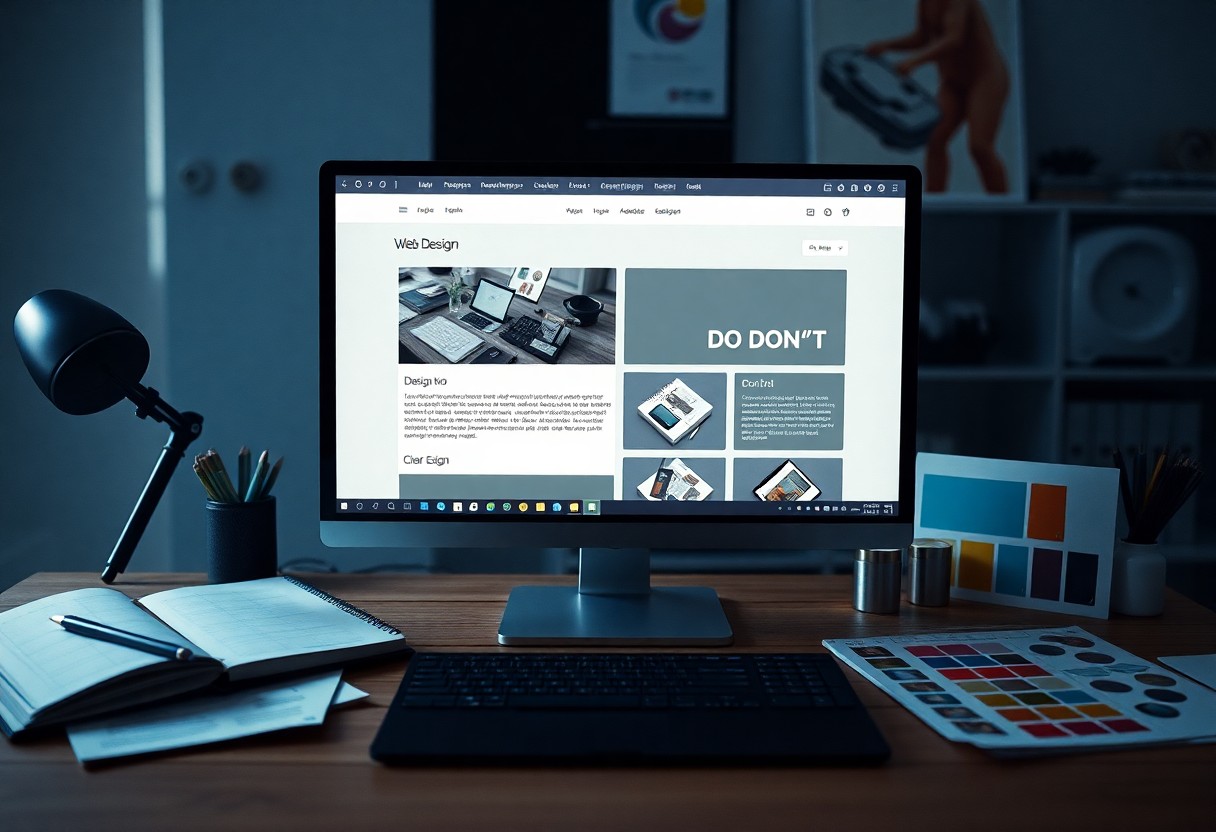
The Dos and Don’ts of Typography in Web Design
Typography plays a significant role in your web design, influencing both readability and user engagement. Understanding the vital dos and don’ts can elevate your website’s aesthetic while ensuring clear communication with your audience. You will learn how to choose appropriate fonts, maintain hierarchy, and balance spacing, all of which are vital for an effective typography strategy. Avoid common pitfalls that can compromise the user experience and create a cohesive design that reflects your brand’s identity.
The Importance of Typography in Web Design
Strong typography forms the backbone of effective web design, influencing users’ engagement and interactions. Thoughtfully chosen fonts enhance the overall aesthetic, establish brand identity, and can drastically change how content is perceived. High-quality typography not only attracts attention but also guides users through the information, making it a vital tool for online communication.
Enhancing Readability
Readable typography invites visitors to consume your content rather than struggle with it. By selecting appropriate typefaces, sizes, and line heights, you create an effortless reading experience that encourages users to stay on your site longer. Aim for high contrast with background colors and keep paragraphs short to facilitate scanning.
Creating Visual Hierarchy
Visual hierarchy helps users navigate your content intuitively, guiding them toward key pieces of information. Utilizing various font weights, sizes, and colors establishes relationships among text elements, indicating which information is most important. For instance, using a larger font for headings and a smaller size for body text directs focus and enhances content flow, providing a seamless browsing experience.
Effective visual hierarchy is achieved through a combination of size, weight, and spacing. For example, a bold header in a larger size draws immediate attention, while subheadings in a slightly smaller, lighter font maintain the flow without overwhelming the reader. Employing these principles not only makes your content more digestible but also reinforces your brand’s visual style, providing a cohesive user experience across the site.
Choosing the Right Fonts
Your choice of fonts significantly affects not only the aesthetics of your web design but also user experience. Aim for readability, ensuring that selected fonts are legible on various screens and sizes. Consider using a combination of serif and sans-serif fonts to create visual contrast while maintaining harmony. Limit the number of font families you use to two or three, to prevent overwhelming your audience and to maintain a cohesive design.
Font Pairing Techniques
Combining fonts effectively can elevate your design. Aim for contrast while retaining a sense of balance; for instance, pair a bold sans-serif for headers with a light serif for body text. Tools like Google Fonts provide suggested pairings, but experimentation is key. Consider the overall mood of your website—playful designs can use rounded fonts, while more professional sites may benefit from sleek, modern types.
Considering Brand Identity
Your brand identity must reflect in your font choices. Fonts convey emotions and set the tone for your website, whether playful, serious, or luxurious. Opt for scripts and whimsical fonts for creative brands, while robust and clean typography works best for corporate identities.
Successful brands like Coca-Cola utilize distinct, recognizable typography that resonates with their identity. You can achieve a similar effect by choosing fonts that reflect your brand’s personality. A tech company may prefer modern sans-serif fonts, while a traditional bookstore might lean towards classic serifs. Analyze your target audience’s preferences and how they perceive various font styles to align your typography with your brand ethos effectively.
Casing and Color Choices
Casing and color decisions significantly impact your website’s readability and overall aesthetic. The way text appears on your site can either enhance or detract from user experience. Striking the right balance among casing styles and color selections ensures that your content is both engaging and accessible to your audience.
Best Practices for Text Color
Select colors that promote readability and contrast effectively against backgrounds. Use dark text on light backgrounds and vice versa, following accessibility guidelines like a minimum contrast ratio of 4.5:1 for body text. Incorporate brand colors strategically but prioritize clarity over aesthetics to ensure your message remains the focus.
Appropriate Use of Uppercase and Lowercase
Using uppercase and lowercase letters appropriately can enhance comprehension and flow. Uppercase letters can signify importance or draw attention to particular elements, while lowercase letters provide a more casual tone and improve readability. Limit the use of all caps to headings or calls to action to prevent overwhelming your audience.
Frequent all-uppercase text can be perceived as shouting and should be avoided in lengthy passages. Instead, use uppercase for specific calls to action or headlines where emphasis is needed. Mixing cases in body text improves readability and allows users to navigate your content more intuitively. A balanced approach that leverages lowercase for general text and uppercase judiciously for emphasis ensures clarity while maintaining visual hierarchy. This thoughtful application contributes to a more enjoyable user experience.
Font Size and Spacing
Choosing the right font size and spacing can dramatically enhance readability and overall user experience. You should always consider your audience and the devices they use. Consistency across headers, body text, and calls to action plays a vital role in creating an organized layout while ensuring your content is accessible to everyone.
Optimal Font Sizes for Different Devices
Different devices require varied font sizes for optimal readability. On mobile devices, body text should typically be no smaller than 16px, while desktop screens can accommodate larger sizes, often around 18px-20px. Headings, in contrast, should be distinctly larger to capture attention, ranging from 24px to 36px depending on hierarchy.
Line Spacing and Letter Spacing Guidelines
Effective line spacing and letter spacing improve reading flow and clarity. Generally, line spacing should be 1.5 times your font size for body text, while letter spacing should be adjusted to prevent overcrowding, usually set between 0.5 to 1.5px for readability without compromising aesthetics.
Line spacing, also known as leading, enhances readability by creating visual breathing room between lines of text. A leading value that is 1.5 times the font size facilitates smoother reading, especially in longer paragraphs. For letter spacing, tighter adjustments create a more compact look suitable for headlines, while wider spacing may enhance legibility in body text. Balancing these elements contributes to an overall harmonious design, allowing users to navigate your content effortlessly.
Responsive Typography
Responsive typography ensures that text is legible and aesthetically pleasing across different devices and screen sizes. As users switch between mobile phones, tablets, and desktops, your typography should adjust seamlessly. This adaptability enhances user experience and keeps your content accessible, making it crucial to incorporate responsive principles in your design workflow.
Adapting Fonts for Various Screen Sizes
Adapting your fonts involves selecting sizes that work well on every device. On smaller screens, reduce font sizes to maintain readability without overwhelming the user. Consider using relative units like ’em’ or ‘rem’ instead of fixed ‘px’ values, allowing text to scale efficiently. This technique keeps your typography dynamic and responsive to user preferences and device capabilities.
Using CSS for Responsive Design
CSS plays a vital role in implementing responsive typography. Media queries let you define specific styles for different screen sizes, allowing text to resize or change based on the device. You can set different font sizes for mobile, tablet, and desktop views, ensuring that your content remains clear and visually appealing, regardless of how users access your website.
Utilizing CSS effectively involves a strategic approach to media queries and responsive elements. For instance, you could set a base font size of 16px for desktops and adjust it down to 14px for tablets, and further to 12px for mobile devices. This method not only maintains readability but also respects user experience by preventing text overflow and ensuring content fits comfortably within the viewport. Remember to monitor how these changes affect your layout to fine-tune adjustments as needed.
Common Typography Mistakes to Avoid
Avoiding common typography pitfalls can greatly enhance user experience and engagement on your website. Small decisions, such as font choices and text alignment, contribute significantly to how visitors perceive your content. Neglecting these elements can lead to misunderstandings or disengagement, which is counterproductive for your site’s objectives. Focus on refining your typography to support your overall design strategy and enhance your messaging.
Overusing Different Fonts
Using too many fonts can create visual chaos and distract from your message. Stick to a limited selection—typically two to three complementary fonts—across your website. This approach promotes consistency and coherence, guiding the reader’s eye and improving overall readability without overwhelming them with visual noise.
Ignoring Accessibility Standards
Ignoring accessibility standards can alienate a significant portion of your audience. Ensuring your typography is legible for all users, including those with visual impairments, is vital. Utilize appropriate font sizes (at least 16px for body text) and high color contrast between text and background. Following Web Content Accessibility Guidelines (WCAG) helps create a more inclusive experience, ultimately broadening your reach and improving user satisfaction.
Making your website accessible isn’t merely a legal requirement; it’s an ethical responsibility that expands your audience. For instance, approximately 15% of the global population experiences some form of disability. Ignoring accessibility can lead to lost opportunities and diminished user engagement. Incorporating features like adjustable font sizes, screen reader compatibility, and visually distinct links ensures a user-friendly experience for everyone, reinforcing your brand’s reputation as inclusive and thoughtful.
Final Words
To wrap up, effective typography in web design enhances readability and user experience. You should prioritize legibility by choosing appropriate font sizes and styles while maintaining a consistent hierarchy. Avoid overcrowding your design with too many fonts or styles, as simplicity often leads to better communication. Additionally, consider the contrast and spacing to guide your audience’s attention seamlessly. By following these dos and don’ts, you can create visually appealing and functional designs that resonate with your users.