The Science of Color Psychology – How to Use Color to Influence Behavior
Psychology reveals that colors significantly impact emotions and behaviors, affecting how you perceive your surroundings. By understanding the principles of color psychology, you can strategically use color in various settings, whether it’s in your home, workplace, or marketing materials. This guide will explore various colors and their associated meanings, enabling you to harness their power effectively to influence decision-making, moods, and even productivity.
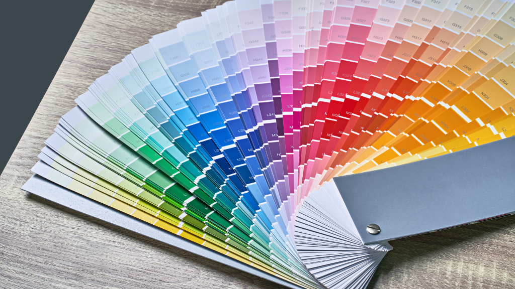
Understanding Color Psychology
Color psychology explores how hues affect human behavior and emotional states. Each color carries distinct meanings and can evoke specific feelings, influencing choices, moods, and even physiological responses. By understanding color psychology, you can enhance your environment, marketing strategies, and personal interactions to resonate emotionally with others.
Fundamental Principles of Color
At the core of color psychology are fundamental principles that help you understand the role of colors in human perception. Colors can be classified into warm, cool, and neutral categories, each possessing unique characteristics. Warm colors like red and orange evoke energy and excitement, while cool colors such as blue and green promote calmness and relaxation.
The Emotional Impact of Colors
Colors significantly influence emotions, often triggering subconscious responses. For example, blue can instill feelings of trust and security, making it popular in corporate branding. Conversely, red often stimulates urgency and appetite, frequently used in food marketing.
Research backs these observations: a study found that 85% of consumers make decisions based on color alone. This impact extends to various settings, like green in hospitals fostering healing atmospheres, while yellow can increase mental stimulation. Tailoring your use of color to align with your goals can be a powerful tool in shaping perceptions and behaviors.
How Colors Affect Behavior
Colors play a pivotal role in shaping how you perceive and interact with your environment. Research shows that specific colors can induce particular emotional responses, influencing your decisions, moods, and even physical reactions. For example, warm tones like red and orange can stimulate energy and urgency, while cooler shades such as blue and green often promote calmness and tranquility. By understanding these effects, you can harness color strategically to foster desired behaviors and emotional states in various contexts.
Color Associations and Their Meanings
Your perception of color is often linked to cultural and psychological associations. Red is commonly associated with passion, energy, and urgency, making it effective for quick decisions. Blue represents trust and stability, ideal for corporate branding. Green evokes feelings of tranquility and health, often used in wellness spaces. Each hue carries its own symbolism, which can influence how you respond in different situations, making it vital to choose colors that align with your intended message.
Psychological Triggers of Color Usage
Colors act as psychological triggers that can prompt immediate emotional responses or behavior alterations. For instance, yellow can invoke feelings of happiness and optimism, while black often conveys sophistication but may also evoke sadness. Using colors strategically in your environment or marketing can heighten engagement or compel action. Studies indicate that consumers often make subconscious decisions based on the dominant colors presented, underscoring the powerful role color plays in influencing thought processes and behavior.
Exploring the psychological triggers of color usage reveals fascinating insights into human behavior. For example, a study published in the Journal of Experimental Psychology found that consumers are 80% more likely to remember a brand due to color recognition. Fast-food chains frequently utilize red and yellow to create a sense of urgency and stimulate appetite. In contrast, luxury brands might lean towards black and gold to suggest exclusivity and prestige. Understanding these triggers helps you apply color effectively in marketing, design, and personal spaces, ultimately guiding the emotions and actions of those who interact with your color choices.
Factors to Consider When Using Color
Utilizing color effectively requires understanding several factors that influence its impact on behavior. Consider these elements during your color selection process:
- Target audience demographics
- Brand identity and messaging
- Color combinations and contrasts
- Setting and location
- Medium and material used
The chosen colors should resonate with the intended emotions and behaviors you seek to evoke.
Cultural Perspectives on Color
Cultural backgrounds significantly affect how individuals interpret colors. For instance, while red signifies luck and prosperity in China, it may denote danger in Western cultures. Understanding these cultural nuances enables you to tailor your color choices to resonate positively with diverse audiences.
Context and Environment Influence
The context in which colors are presented alters their effects. Bright, vibrant colors can energize a space, making them suitable for creative environments, whereas muted tones foster calm, ideal for healthcare settings. Adapting your color choices to the physical environment ensures they align with the desired atmosphere.
For example, studies indicate that blue hues can enhance productivity in office spaces, while warmer colors like orange might stimulate conversation in social areas. Your environment—whether it’s an office, home, or public space—shapes how colors are perceived and experienced. Selecting the right colors based on these contextual cues can optimize the influence you intend to achieve.
Tips for Applying Color Psychology
Utilizing color psychology can profoundly influence behaviors in various settings. Start by assessing the emotions you want to evoke and select colors that align with those goals. Here are some tips to guide your application:
- Identify the target audience and their color preferences.
- Choose colors that resonate with your brand’s identity.
- Implement contrasting colors to draw attention to key areas.
- Test different color schemes for effectiveness.
Knowing these tips will help you create visually appealing environments that engage and motivate your audience.
Color Selection for Marketing
In marketing, color selection can determine the success of your campaigns. Research shows that consumers make snap judgments about products within 90 seconds, with color being a decisive factor. Warm colors like red can stimulate action, while cool colors like blue evoke trust. Analyze your market and choose a palette that reinforces your messaging, enhancing brand recall and emotional connection.
Implementing Color in Design Spaces
Incorporating color into design spaces requires an understanding of the intended purpose. For example, warm tones in a restaurant can create an inviting atmosphere, encouraging longer stays, while cooler tones in a healthcare setting instill calmness. Consider factors such as lighting, the size of the space, and the target demographic. Integrating accent colors can also highlight specific areas or features, making them more inviting.
Create zones within your design using color to direct flow and influence mood. For instance, a productivity-focused office might use softer blues and greens alongside bright accents to stimulate creativity. Ensure colors complement one another to avoid visual discord. Regularly assess how individuals respond to these colors and adjust as necessary for optimal engagement, ensuring a cohesive and functional environment that aligns with your objectives.
How to Measure Color’s Influence
Measuring the influence of color on behavior requires a systematic approach to isolate variables and gauge responses accurately. You can utilize controlled environments or surveys to assess how changes in color affect emotions, decision-making, and purchasing behaviors. Conducting A/B testing with different color options in design can yield quantifiable results on user engagement and preference, providing you with clear insights into color’s effectiveness in various contexts.
Tools and Techniques for Assessment
Various tools and techniques can enhance your ability to assess color’s impact effectively. Online survey platforms such as SurveyMonkey or Google Forms allow you to gather user feedback on color preferences and associations. Eye-tracking software can analyze where attention is drawn in relation to different colors. Additionally, software like Adobe Color can help visualize color harmony, enabling you to create palettes that resonate with your target audience.
Interpreting Color Impact Data
Interpretation of color impact data involves analyzing trends and correlations that emerge from your assessments. You might discover that specific colors elicit predictable emotional responses, guiding your decisions in design choices. Evaluating the feedback or behavioral changes against demographics ensures you understand how distinct groups perceive color differently. Furthermore, comparing data across various studies enhances the reliability of your conclusions, allowing you to apply color strategies with confidence.
For instance, if your data indicates that users respond positively to blue hues, you could further segment the responses by age or profession, revealing that younger individuals prefer vibrant hues while older audiences favor muted tones. This nuanced understanding allows you to tailor your color usage in different marketing materials or environments, ultimately enhancing user engagement and influencing behaviors in a more targeted manner. By continuously refining your approach based on data interpretation, you maximize the effectiveness of your color strategies.
Practical Applications of Color Psychology
Implementing color psychology can transform your approach to branding, advertising, and product design, allowing you to engage your target audience more effectively. By understanding how different hues evoke emotional responses, you can strategically select colors to enhance communication, influence customer behavior, and create lasting impressions.
Enhancing Branding and Advertising
The right color choice can elevate your brand identity and enhance the effectiveness of your advertising. Colors like blue convey trust and reliability, making them ideal for finance and healthcare companies, while vibrant reds and oranges can evoke excitement and motivate quick action in retail promotions. Tailoring your color palette to resonate with your target audience fosters a deeper emotional connection.
Creating Product and Space Appeal
Your choice of color can significantly impact how consumers perceive your products and the spaces they inhabit. For instance, using soft, calming colors in a spa setting creates a serene atmosphere, while brighter colors can inject energy into retail spaces. Research shows that up to 85% of consumers base their purchasing decisions on color alone, emphasizing the importance of vibrant yet appropriate color selections for aesthetic appeal.
Conclusion
Considering all points, understanding the science of color psychology empowers you to make informed decisions in various aspects of your life, from marketing strategies to personal branding and interior design. By recognizing how different colors can evoke specific emotions and influence behaviors, you can effectively harness this knowledge to enhance communication, attract attention, and create desired atmospheres. Cultivating awareness of color’s impact allows you to strategically apply it in your interactions, fostering more meaningful connections and outcomes.