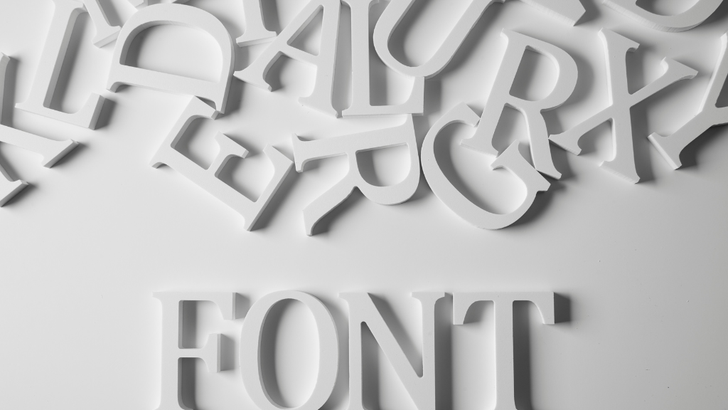
Navigating the World of Font Pairing – Tips for Harmonious Typography
Many designers and content creators understand that effective font pairing can elevate your design projects significantly. By thoughtfully combining typefaces, you can create visual harmony, enhance readability, and convey the right message to your audience. In this guide, you will discover practical tips and techniques to refine your typography choices, ensuring that your text is not only aesthetically pleasing but also functional. With these insights, you’ll be better equipped to craft compelling, harmonious designs that resonate with your viewers.
Understanding Font Anatomy
Familiarity with font anatomy is vital for effective design. Each typeface contains specific components—like ascenders, descenders, serifs, and terminals—that influence its overall character. Recognizing these elements helps you assess how different fonts will interact in pairings, ensuring clarity and aesthetic appeal. A well-matched font combination considers not just style, but also how these anatomical features work together to create harmony on the page.
Serif vs. Sans-Serif
Choosing between serif and sans-serif fonts impacts emotional tone and readability. Serif fonts, characterized by their small lines or strokes at the ends of letters, evoke a traditional and formal feel, making them ideal for print materials. Sans-serif fonts, lacking these embellishments, offer a clean and modern appearance, often used in digital formats for their legibility. Depending on your project, one may serve your message better than the other.
Script and Display Fonts
Script and display fonts serve as expressive tools in typography, providing unique flair. Script fonts mimic cursive handwriting, conveying elegance and creativity, perfect for invitations or branding. Display fonts, on the other hand, are designed to stand out, often featuring exaggerated features or artistic styles, best suited for headlines and promotional materials that require immediate attention.
Integrating script and display fonts into your designs can elevate the visual impact if done thoughtfully. For instance, pairing a bold display font for headlines with a stylish script for subheadings can create a compelling contrast that captures attention. However, ensure readability remains a priority; avoid complex scripts in small sizes. Experimentation with various combinations allows you to find the right balance, enhancing your design without overwhelming the viewer.
The Importance of Contrast
Contrast in typography enhances readability and draws attention to key elements. By effectively utilizing differing styles and weights, you create a visual hierarchy that guides the viewer’s eye through your content. This differentiation helps establish an emotional connection with your audience, emphasizing the most important messages while maintaining a cohesive design throughout your project.
Size and Weight
Varying the size and weight of fonts adds depth to your layout. Larger font sizes can signify headings or important information, while smaller weights can support the body text. Choosing a bold typeface for titles and a lighter version for subtitles seamlessly creates a rhythm that captures and retains attention, making your content more engaging.
Color and Spacing
Color and spacing are fundamental to achieving an optimal visual experience in typography. Utilizing contrasting colors between text and background increases legibility, while appropriate line spacing prevents text from feeling cramped, thus encouraging better absorption of information.
Experimenting with different color combinations can evoke specific emotions; for instance, dark text on a white background offers high contrast and clarity, while pairing softer hues creates a more subtle, inviting feel. Space around letters, known as kerning, and between lines, called leading, can significantly impact readability. Proper spacing ensures that your typography remains legible even at a glance, guiding your audience through your content smoothly and effectively.
Establishing Hierarchy
Effective typography relies on a clear visual hierarchy, guiding the reader through your content effortlessly. By establishing distinct levels of importance among your text elements, you enhance readability and engagement. Utilize various font sizes, weights, and styles to indicate the significance of headings, subheadings, and body text. This approach allows you to communicate your message clearly while keeping the reader’s attention where it matters most.
Headings and Subheadings
Headings should convey the main themes of your content, while subheadings offer insight into subsections. Choose bold, larger typefaces for headings to ensure they stand out, and consider a slightly smaller size or varied weight for subheadings. This differentiation creates a visual roadmap, making it easier for readers to scan and locate information quickly.
Body Text
Body text is where your main content resides, and its readability significantly impacts user experience. Select a clear, legible typeface, typically sans-serif for digital platforms, and maintain a font size of at least 16 pixels for optimal readability. Line spacing should also be generous to prevent text from feeling cramped, enhancing comfort while reading.
Experiment with line length as well; studies suggest that 50-75 characters per line improve reading speed and comprehension. Avoid using overly complicated fonts that may distract from your message. Additionally, ensure sufficient contrast between your body text and background to enhance visibility. Consistency in body text styling across different sections establishes professionalism and invites the reader to engage with your content deeply.
Common Font Pairing Techniques
Applying effective font pairing techniques can elevate your designs by creating visual harmony and interest. These methods guide you in combining typefaces that complement each other or offer striking contrasts, enhancing readability and aesthetic appeal. Mastering these techniques allows you to craft layouts that effectively communicate your intended message and engage your audience.
Complementary Pairs
Complementary pairs consist of typefaces that share similar characteristics, allowing for a cohesive look across your design. For instance, combining a sans-serif font with a subtly contrasting serif font creates a balance while maintaining unity. Consider pairing a modern, clean sans-serif for headings with a classic, elegant serif for body text to generate an inviting atmosphere that promotes readability.
Contrasting Styles
Contrasting styles bring together typefaces that differ significantly, creating visual tension and interest. Pairing a bold, decorative typeface with a simple, understated font can draw attention to key messages while maintaining an organized structure. This technique encourages viewers to engage with your content, as the striking juxtaposition naturally guides the eye across the page.
Employing contrasting styles effectively involves balancing elements like weight, size, and mood. For example, using a heavy display font for headlines paired with a light, sans-serif body font allows each element to hold its own while contributing to the overall design. The combination not only fosters visual excitement but also enhances clarity, ensuring that important information stands out prominently. Aim to select contrasting fonts with a complementary color scheme to further strengthen the connection between them and unify your design choice.
Tools and Resources for Font Pairing
Utilizing the right tools and resources can significantly streamline your font pairing process. Various platforms and tools exist to help you discover, compare, and combine fonts that resonate well together. Whether you are a seasoned designer or a beginner, having access to these resources will enhance your typography skills and overall design quality.
Online Font Pairing Tools
Online font pairing tools simplify the process of finding complementary typefaces. Websites like Canva, FontPair, and Google Fonts’ “Pairings” feature allow you to explore font combinations while previewing how they look together in real-time. You can filter by categories or styles, providing tailored options that align with your project’s needs.
Design Inspiration Platforms
Design inspiration platforms serve as treasure troves of creative ideas for typography. Sites such as Dribbble, Behance, and Pinterest offer endless reference points showcasing innovative font pairings across various applications. Browsing these platforms not only inspires you but also exposes you to current trends and effective designs adopted by other professionals.
These platforms often feature curated collections that highlight successful font combinations, allowing you to see how experienced designers approach typography. For example, you can explore specific tags related to branding or poster design to uncover effective pairings that resonate with your creative vision. Engaging with community feedback, such as comments and likes, can further guide your choices and expose you to different styles that you might not have considered before.
Practical Applications in Design
Incorporating successful font pairing into your design projects can significantly enhance user experience and brand perception. Understanding the contexts—whether for web or print—allows you to tailor typography to suit your audience and platform, ensuring clarity and engagement across diverse mediums.
Web Typography
Web typography plays a vital role in user interface design, impacting readability and accessibility. Utilizing web-safe fonts, leveraging responsive design, and maintaining a clear hierarchy can boost user engagement. Features like font size adaptability and line spacing can enhance legibility on various devices, ensuring your message reaches your audience effectively.
Print Design
Print design necessitates a different approach to typography due to physical constraints and the tactile experience it offers. Balancing fonts for headlines and body text is crucial, as larger fonts draw attention while smaller sizes maintain readability. Consistency across your printed materials establishes brand identity and emphasizes your message.
In print design, choosing the right paper type complements your font pairings and overall aesthetic. For instance, using a matte finish can soften the appearance of serif fonts, whereas glossy paper enhances the brightness of sans-serif fonts. Case studies show brands leveraging unique typefaces, such as bold display fonts for headings combined with classic body text, to create striking contrasts that capture attention and convey professionalism effectively. Maintaining a limited color palette alongside your chosen fonts further solidifies your design’s visual cohesion.
Conclusion
With these considerations in mind, you can confidently explore the art of font pairing to elevate your designs. By understanding the principles of contrast, hierarchy, and harmony, you can create visually appealing typography that enhances readability and communicates your message effectively. Take the time to experiment with different combinations, and trust your instincts to find the perfect balance in your projects.