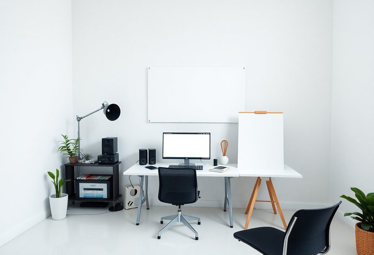
How to Effectively Use White Space in Graphic Design
Design is not solely about choosing colors and fonts; the strategic use of white space can significantly enhance your graphic projects. By understanding how to incorporate this imperative element, you can create designs that are not only visually appealing but also functional. White space allows your content to breathe, guiding the viewer’s eye and improving overall comprehension. In this post, you will discover practical tips on how to effectively utilize white space to elevate your designs and achieve a more polished, professional look.
Understanding White Space
White space, often referred to as negative space, is the area in a design that is intentionally left unmarked. This space is imperative as it helps create a balanced composition, draws attention to key elements, and enhances overall readability. By strategically incorporating white space, your designs can become more engaging and visually appealing, guiding viewers’ focus and improving their experience.
Definition and Importance
White space serves as a vital component of graphic design. It is not merely empty space but a powerful design tool that influences how your audience receives information. Effective use of white space can enhance the clarity and impact of your designs, allowing your message to resonate more strongly with your audience.
Types of White Space
There are two main types of white space: active and passive. Active white space is intentionally used to draw attention to specific elements, while passive white space naturally occurs in a design without any active manipulation. Understanding these types enables you to leverage white space effectively and create layouts that are not only functional but also aesthetically pleasing.
| Active White Space | Draws attention and organizes elements |
| Passive White Space | Enhances readability without distraction |
| Positive Space | Elements that hold visuals or text |
| Negative Space | Surrounding areas that create balance |
| Consistent Margins | Creates uniformity and flow in layouts |
- Active white space is designed and structured to guide the viewer’s gaze towards focal points.
- Conversely, passive white space allows the eyes to rest, creating a more enjoyable viewing experience.
- Both types can be employed strategically to create compelling narratives in design.
- Understanding these distinctions helps you balance elements effectively.
- Any design benefits from a thoughtful approach to both active and passive white space.
Exploring various styles of white space can enhance your overall graphic design strategy. Ensuring there is ample spacing between different sections fosters clarity and cohesiveness. For instance, implementing consistent line spacing in typography improves legibility, while generous margins around images can give your layout a polished look. By varying the types of white space used, your designs can achieve a harmonious balance that appeals to the audience.
| Consistent Line Spacing | Improves text readability |
| Generous Margins | Creates a polished and clean appearance |
| Spacing Between Elements | Helps avoid cluttered designs |
| Proximity Principles | Groups related items together for clarity |
| Contextual Use | Adapts to the content’s purpose and tone |
- Employing these types strategically can elevate your design work significantly.
- Context and content dictate how to integrate white space for maximum effect.
- Experiment with various layouts to discover effective white space applications.
- Emphasizing your key messages through space contributes to effective communication.
- Any design can achieve greater impact through thoughtful application of various whitespace techniques.
How to Use White Space Effectively
Strategically applying white space enhances your design’s overall appeal and effectiveness. This approach allows you to create a visual hierarchy and directs the viewer’s focus to the most important elements. Keep in mind that white space doesn’t have to be uniform; varying the amount can guide the viewer’s eye and accentuate specific content areas, making an impactful visual statement.
Balancing Elements on the Page
Achieving balance in your layout is crucial. Distributing elements evenly across the page helps prevent clutter while making your design aesthetically pleasing. Experiment with positioning text and images to maintain equilibrium; for instance, if one side has a large image, consider placing smaller text blocks strategically on the opposite side to create harmony.
Enhancing Readability and Comprehension
Well-placed white space significantly boosts readability and comprehension. By providing ample margins and spacing between text lines or paragraphs, you allow the reader to process information more easily. This intentional separation minimizes cognitive overload, making it simpler for your audience to engage with the content.
Consider a study from the Nielsen Norman Group, which revealed that users read only about 20% of the text on a web page. Adequate white space can increase the retention of information by allowing readers to concentrate on key messages. Use appropriate spacing between headings, subheadings, and body text to create a clear visual path that draws readers in and keeps their attention on your key points. Effective use of white space not only makes your content look more inviting but also ensures that it is memorable and accessible.
Tips for Maximizing White Space
Maximizing white space can transform your designs from cluttered to cohesive. Utilize these strategies to enhance your layouts:
- Prioritize vital elements.
- Use consistent margins and padding.
- Group related items together.
- Incorporate visual breaks.
- Limit font variations.
The effective use of white space ultimately leads to clarity and better communication in your design.
Utilizing Margins and Padding
Margins and padding create breathing room around your design elements. By ensuring adequate spacing, you draw attention to important content and prevent overwhelming viewers. Define a standard margin size for your designs, and adjust padding within individual components to create balance. Thoughtful application can elevate your design without overcrowding.
Incorporating Visual Hierarchy
Visual hierarchy plays a pivotal role in guiding users through your design. By adjusting the size, color, and placement of elements, you can dictate the order in which your audience experiences content. Headlines should be prominent, while subtitles and body text take secondary roles. This strategic layering directs attention, making key information stand out and enhancing usability. The integration of white space between these elements reinforces their hierarchy, allowing viewers to process information effortlessly and efficiently.
Factors to Consider When Designing
Designing with white space requires careful consideration of various elements. Key factors include understanding the balance between white space and content, the visual hierarchy, the purpose of your design, and how each element interacts. Evaluate these aspects to achieve harmony in your layout. Thou must ensure that every design choice serves a clear purpose and contributes to the overall aesthetics.
- Balance between white space and content
- Establishing visual hierarchy
- Understanding the design’s purpose
- Element interaction and placement
Target Audience and Context
Identifying your target audience significantly influences how you utilize white space. Your demographic’s preferences dictate the level of minimalism or detail needed. For instance, a design aimed at a trendy tech-savvy crowd may benefit from bold, spacious layouts, while a more traditional audience might respond better to classic, structured designs. Tailoring your approach to their expectations fosters connection and clarity.
Brand Identity and Message
Your brand identity should resonate throughout your design, and white space plays a pivotal role in this alignment. Every visual element, from colors to typography, reflects your brand’s values and personality. Effective use of white space can reinforce your message by creating significant emphasis on key features or concepts. This approach elevates your brand’s voice and ensures recognition in a crowded marketplace.
Engaging design leverages white space not just for aesthetics but as a canvas for your brand narrative. For example, Nike’s minimalist designs use empty space to evoke feelings of empowerment and aspiration. Meanwhile, Apple highlights innovative products against ample white space to emphasize simplicity and sophistication. This visual storytelling strengthens brand identity and fosters deeper connections with your audience, ensuring that your message is clear and memorable.
Common Mistakes to Avoid
Too often, designers fall into traps that undermine their use of white space. Familiarizing yourself with these common mistakes can significantly enhance your design work. Avoiding overcrowding, neglecting mobile responsiveness, and underutilizing margins are just a few pitfalls that can detract from a clean, effective design.
Overcrowding with Elements
Filling every inch of your design with elements can create visual chaos. Prioritize your content by allowing space between elements for clarity and emphasis. When you overcrowd your design, vital information may get lost, frustrating users and diminishing the overall impact.
Neglecting Mobile Responsiveness
Failing to adapt your design for mobile devices can alienate a significant portion of your audience. With over 54% of global website traffic originating from mobile devices, ensuring your layout accommodates smaller screens is necessary for user engagement and accessibility.
A mobile-responsive design requires more than just shrinking existing elements. It often involves rethinking your layout, optimizing font sizes, and ensuring buttons and images are touch-friendly. Ignoring these aspects can lead to user frustration and increased bounce rates, as visitors struggle to navigate crowded elements or decipher illegible text on their smartphones. Implementing fluid grids, media queries, and flexible images can elevate your design, making it functional and aesthetically appealing across all devices.
Practical Applications in Graphic Design
Understanding how to implement white space effectively can turn an ordinary design into an extraordinary one. You can apply it with intention to create visual hierarchy, guide user attention, and enhance readability. Whether designing an advertisement, website, or corporate branding, consider how strategically placed white space can convey your message more powerfully, allowing key elements to shine.
Print vs. Digital Media
In print media, white space influences the overall aesthetic and can lead to a more polished final product. With digital media, responsiveness and interactive elements must be considered, as white space impacts user navigation and engagement across different devices.
Case Usage in Different Design Projects
White space plays distinct roles in various design projects, from business cards to website layouts. A clean business card utilizes space to ensure imperative information stands out, while an e-commerce site can leverage white space to enhance product visibility, increasing conversion rates by up to 20% when products are well-spaced.
Conclusion
From above, you can see that effectively using white space in graphic design enhances visual appeal and clarity. By strategically incorporating empty areas, you can create a balanced layout that highlights necessary elements, improves readability, and guides viewers’ attention. Prioritize white space in your designs to foster a professional aesthetic and ensure your message resonates with your audience. Embrace this fundamental principle to elevate your creative projects and achieve impactful results.


