Crafting Compelling Call-to-Actions – Design Tips for Higher Conversions
Many marketers struggle to create call-to-actions (CTAs) that truly resonate with their audience. To enhance your conversion rates, it’s necessary to focus on design elements that attract attention and compel action. By understanding the psychology of your audience and applying effective design techniques, you can craft CTAs that not only stand out but also drive your visitors to take the desired steps. This guide will provide you with necessary tips to elevate your CTAs and maximize your conversion potential.
Understanding Call-to-Actions
Clear comprehension of call-to-actions (CTAs) is imperative for optimizing your marketing efforts. A CTA serves as an invitation for your audience to take a specific action, guiding them through their customer journey. When well-crafted, CTAs not only tell your audience what you want them to do but also create a sense of urgency and importance that drives engagement and conversions.
Definition of Call-to-Actions
A call-to-action (CTA) is a prompt that encourages your audience to take a desired step, such as signing up for a newsletter, purchasing a product, or downloading a resource. Effective CTAs are typically concise, visually distinct, and strategically placed to capture attention at pivotal moments in the user experience.
Importance of Effective CTAs
Effective CTAs directly influence conversion rates by guiding your audience toward desired actions. They can significantly affect user behavior; studies indicate that well-optimized CTAs can improve conversion rates by up to 300%. By creating a sense of urgency or highlighting benefits, you increase the likelihood that users will follow through with your desired action, ultimately driving sales and engagement.
Focusing on the importance of effective CTAs reveals their potential in shaping the success of your marketing initiatives. For example, A/B testing various phrases, colors, and designs can yield insights into which CTAs resonate best with your audience. Additionally, integrating personality and relevance into your CTAs ensures a more personalized connection, making users feel understood and more inclined to act. Ultimately, every cumulative improvement can lead to substantial increases in your overall business performance.
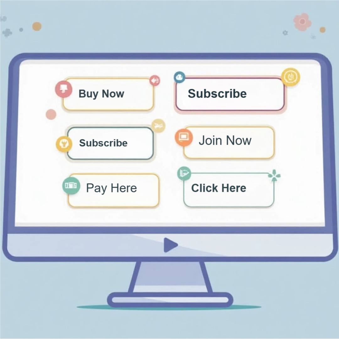
Designing Eye-Catching CTAs
Effective CTAs must be visually appealing to grab attention and encourage user actions. When designing these important elements, focus on distinct positioning, shapes, and colors that resonate with your audience. A well-placed, attractive CTA can significantly lift conversion rates, making it necessary to experiment with various designs and placements to find what works best for your specific context.
Color Psychology
Colors convey emotions and influence behavior, making them a vital part of your CTA design. For instance, red evokes urgency and excitement, while blue conveys trust and security. Selecting the right color represents not just your brand but also aligns with the desired action. Using contrasting colors for your CTAs can further enhance visibility and draw clicks, ensuring they stand out from the surrounding content.
Typography and Readability
Choosing the right font can make or break the impact of your CTAs. Opt for bold, easily readable typefaces that complement your brand identity. Ensure that the font size is large enough to catch attention without overwhelming the viewer. Maintaining appropriate line spacing enhances readability, allowing users to quickly grasp your message and take action.
Beyond aesthetics, the readability of your CTAs contributes significantly to their effectiveness. Sans-serif fonts like Arial or Helvetica often work well in digital formats due to their clean lines and legibility on screens. The right font weight can also emphasize key action words, ensuring your CTAs are direct and compelling. For example, a larger bold font for “Get Started” will create a sense of urgency, encouraging users to act immediately. Testing different typography styles can help identify what resonates best with your audience, ultimately leading to higher conversions.
Placement Strategies for Maximum Impact
Strategically placing your CTAs can significantly enhance engagement and drive conversions. Consider the user journey; CTAs should be positioned at key moments where users are most likely to act, such as after valuable content, in the middle of user flows, or after resolving a problem. This aligns your CTA with users’ decision-making processes, optimizing their chances of clicking through.
Optimal Locations on a Page
Some of the most effective locations for CTAs include above the fold, the end of blog posts, and within sidebars. Positioning a CTA above the fold captures attention immediately, while placement after informative content gives users the motivation to take action. Additionally, sidebars keep your CTA visible as users scroll through your page, serving as a constant visual reminder.
A/B Testing for CTA Placement
A/B testing allows you to experiment with different CTA placements to determine which generates the highest engagement. By splitting your audience and showing each group different placements, you can gather data on click-through rates and conversions. This empirical evidence guides you in optimizing your strategy and achieving better results.
For instance, if you test a CTA positioned at the top of a landing page versus one at the bottom, analyzing the clicks can reveal a clear preference. You might find that a CTA near a compelling image or testimonial outperforms others. Continuous A/B testing can help refine placements over time, ensuring you harness data-driven insights to maximize user interactions and drive conversions effectively. Aim for at least a couple of weeks of testing for reliable results, and always track performance metrics closely.
Crafting Persuasive CTA Copy
Creating compelling copy for your CTAs is important to motivate users to take action. Your words should resonate with the audience, addressing their needs and desires directly. Focus on clarity, brevity, and relevance to guide potential customers towards the desired action, whether that’s signing up, purchasing, or downloading.
Action-Oriented Language
Using action-oriented language energizes your CTAs and prompts users to engage. Incorporate strong verbs that emphasize the benefit of taking action, such as “Get,” “Discover,” or “Join.” This direct approach sparks enthusiasm and encourages immediate response, making users feel empowered to act on their intentions.
Creating a Sense of Urgency
Instilling a sense of urgency persuades users to act swiftly. Use phrases like “Limited time offer,” or “Act now,” which convey that time is a factor, encouraging immediate action rather than prolonged consideration. Highlighting scarcity can enhance this effect, prompting users to avoid missing out on exclusive opportunities.
Incorporating urgency into your CTAs can significantly boost conversion rates. For instance, research shows that adding a countdown timer to promotions can increase engagement by 200-300%. By emphasizing limited availability or deadlines—such as “Only 5 spots left” or “Sale ends midnight”—you not only instill urgency but also create a compelling reason for users to act without delay. This tactic aligns with psychological principles, tapping into the fear of missing out (FOMO) that drives decisions and fosters quicker action.
Utilizing Visual Elements
Visual elements play a pivotal role in making CTAs stand out. By effectively combining colors, images, and layout, you can capture attention and motivate action. Eye-catching visuals, paired with concise messaging, can guide users toward your desired outcome. Utilizing contrasting colors, appropriate spacing, and dynamic images will not only improve engagement but also enhance the overall user experience, making your CTAs far more compelling.
Iconography and Images
Incorporating relevant icons and images directly correlates with the effectiveness of your CTAs. Icons simplify complex messages and make them instantly recognizable. Choosing images that resonate with your target audience can evoke emotional responses, driving users to take action. For example, a playful arrow pointing to a CTA button can create a visual cue that enhances click-through rates.
Button Shapes and Sizes
The shape and size of your CTA buttons significantly influence user interaction. Rounded corners often feel softer and more inviting, while squares convey stability. Ideal button size should ensure readability and touchability, with a minimum of 44×44 pixels for mobile users. A/B testing various shapes and sizes can provide valuable insights, showing which configurations yield the highest conversion rates. The design of buttons can make a substantial difference in user behavior. For example, large buttons with ample white space around them tend to attract more clicks, as they are easier to spot and tap, particularly on mobile devices. Experimenting with different shapes—such as rectangular, pill-shaped, or circular—can also change user perceptions; for instance, circular buttons often imply instant action or urgency, promoting quicker decision-making. Aim for bold colors that stand out from your site’s color scheme, ensuring that your CTAs remain the focal point of your design, driving higher conversion rates.
Mobile Optimization for CTAs
Your audience increasingly engages with content on mobile devices, making mobile optimization for CTAs vital. Ensure that buttons are easily tappable, text is legible, and the overall design adapts seamlessly to different screen sizes. A streamlined user experience on mobile will significantly elevate conversion rates, as users will quickly act on compelling offers without the frustration of a poorly optimized interface.
Responsive Design Considerations
Designing CTAs for responsiveness means your buttons and text must adjust to varying screen dimensions and orientations. Utilize flexible grid systems, scalable images, and appropriate font sizes to enhance usability. A CTA that looks appealing and functions properly on both desktop and mobile fosters a more cohesive user experience, directly impacting conversion potential.
Testing Across Devices
Testing your CTAs across multiple devices and browsers reveals potential issues that may hinder user engagement. From layout discrepancies to functional obstacles, thorough testing ensures that CTAs maintain their effectiveness, regardless of the user’s chosen platform.
Conducting extensive testing across devices involves using tools like BrowserStack or Google Mobile-Friendly Test to assess how your CTAs perform on various screen sizes and resolutions. Additionally, observe user interaction patterns via heatmaps to identify the most engaging layouts. Analyzing real-time data from A/B testing can also help discern which versions of your CTAs resonate best with your audience, enhancing the likelihood of conversions across different platforms.
Conclusion
Taking this into account, crafting compelling call-to-actions involves a blend of clear messaging, visually appealing design, and strategic placement. You should focus on using actionable language that resonates with your audience, ensuring the CTA is noticeable and aligns with your overall goals. By applying these design tips, you enhance user experience and increase the likelihood of higher conversions, ultimately driving the success of your campaigns.