Top 5 Website Design Trends Every Entrepreneur Should Know
Many entrepreneurs today face the challenge of standing out in a crowded digital landscape. By understanding and implementing the latest website design trends, you can enhance user experience, boost engagement, and ultimately drive sales. This post will explore the top five design trends that can elevate your website, ensuring it remains visually appealing and functional while aligning with modern consumer expectations. Stay ahead of the competition and make your online presence more impactful with these crucial insights.
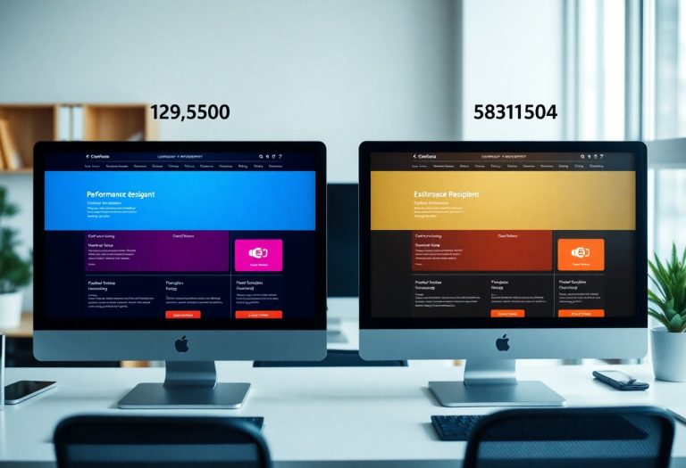
Minimalism: Less is More
In today’s fast-paced digital landscape, minimalist design stands out by emphasizing simplicity and functionality. You can effectively communicate your brand’s message without overwhelming visitors with clutter. A minimalist approach allows for a cleaner aesthetic, making it easier for users to focus on key content and calls to action, ultimately enhancing their experience and engagement on your site.
Importance of White Space
White space acts as a visual breathing room that improves content readability. By providing sufficient space between elements, you create a more organized layout that guides visitors’ attention to what matters most. Utilize white space to separate text from images and to enhance overall aesthetics, making your site appear more professional and polished.
Streamlined Navigation
Streamlined navigation enhances user experience by providing clear pathways to important content. It enables visitors to find what they need quickly, reducing frustration and improving engagement. Aim for a simple, top-level menu structure where users can access important pages like services, about, and contact without unnecessary clicks.
To achieve streamlined navigation, prioritize the most visited pages and eliminate redundant links. A well-organized dropdown menu can minimize choices while keeping the interface clean. Employ breadcrumb trails to help users track their paths and consider mobile optimization to ensure that your navigation remains intuitive across devices. According to studies, sites with streamlined navigation resulted in a 20% increase in user retention, underscoring its effectiveness in retaining customer interest.
Dark Mode: A Modern Aesthetic
Dark mode has transformed the digital landscape, offering not only a fresh aesthetic but also functional benefits that resonate with modern users. This sleek design approach boasts high contrast visuals, enhancing readability while providing a visually pleasing experience. As an entrepreneur, adopting dark mode can signify your brand’s forward-thinking attitude, appealing to users seeking a stylish yet functional online presence.
Benefits for User Experience
Implementing dark mode can significantly enhance user experience by reducing eye strain, especially in low-light environments. Studies show that dark mode can also conserve battery life on OLED screens, resulting in longer device usage times. By offering this option, you cater to user preferences, demonstrating a commitment to their comfort and well-being.
Design Considerations
Effective dark mode design requires careful attention to color contrast, UI elements, and typography. Choosing the right shades is vital; pure black backgrounds can be too harsh, so softer dark greys often work better. Ensure your text maintains high readability against dark backgrounds, as insufficient contrast can lead to frustration rather than ease of use. Balance is key in creating an appealing interface.
Beyond simply inverting colors, prioritizing accessibility is important. Use color palettes that comply with WCAG standards for contrast, ensuring all users can navigate your site comfortably. Consider the nuances of light and dark theme interactions, as certain graphic elements may need adjustments or redesigns to fit seamlessly into the new aesthetic. Testing your designs on diverse devices can highlight potential usability issues, allowing you to refine the experience for your audience.
Micro-Interactions: Engaging Users
Micro-interactions are subtle design elements that enhance user experiences by providing immediate feedback, improving engagement, and guiding users through your website. These small animations or responses, such as button animations, loading indicators, or form validation, can create a more interactive and dynamic feel. Leveraging micro-interactions effectively encourages users to explore your site further, prompting longer visits and higher satisfaction rates.
Enhancing User Engagement
Utilizing micro-interactions can significantly enhance user engagement by making your website feel more responsive and alive. Simple examples include a color change when hovering over a button or a checkmark appearing when a form is submitted successfully. These interactions keep users informed about their actions and create a sense of accomplishment, encouraging them to continue navigating through your content.
Best Practices for Implementation
To successfully implement micro-interactions, focus on subtlety, consistency, and user context. They should not distract or overwhelm users but instead serve to clarify actions and responses. Ensure your designs align with your brand identity and maintain uniformity across the website for a cohesive experience. Testing these interactions with real users will help gauge their effectiveness, ensuring they add value to your site.
Start by identifying key user actions that could benefit from feedback, such as clicking buttons, submitting forms, or navigating between pages. Use tools like CSS animations or JavaScript libraries for smooth and polished effects. Observe user behavior through analytics to determine which interactions resonate most. A/B testing different micro-interactions will help you discover what enhances user satisfaction and engagement the most, allowing you to refine your approach continuously.
Accessibility: Designing for All
Accessibility ensures that your website caters to all users, including those with disabilities. This design ethos not only broadens your audience but also demonstrates your commitment to inclusivity. Implementing accessible features enhances user experience and can significantly impact your brand’s reputation and customer loyalty.
Importance of Inclusive Design
Inclusive design addresses the diverse needs of users by providing equal access to information and functionality. Catering to various abilities allows you to tap into a wider market, showing that your brand values every customer. Websites that prioritize inclusivity often experience higher engagement and reduced bounce rates.
Key Accessibility Features
Essential accessibility features include keyboard navigation, alt text for images, adequate color contrast, and screen reader compatibility. These elements ensure that individuals with visual impairments, hearing disabilities, or other challenges can effectively interact with your site. Implementing these features not only meets legal standards but also enhances the overall user experience.
For instance, keyboard navigation allows users who cannot use a mouse to navigate your website seamlessly. Incorporating alt text for images improves comprehension for screen reader users, while ensuring high color contrast prevents visual strain for those with color blindness. By integrating these key features, your site becomes more user-friendly, allowing everyone to access your information easily, which can lead to increased traffic and higher conversion rates.
Mobile-First Design: Prioritizing Users on the Go
Focusing on mobile-first design ensures your website meets the needs of users accessing it from smartphones and tablets. With over 50% of global web traffic originating from mobile devices, prioritizing mobile functionality not only enhances user experience but also improves SEO rankings. Designing for mobile first means streamlining content and optimizing navigation, allowing for a seamless experience regardless of screen size.
Growing Mobile Traffic
Mobile traffic continues to surge, with recent data showing around 54% of all website traffic now comes from mobile devices. This growth highlights the necessity for businesses to cater to mobile users. By optimizing your site for mobile, you can tap into this expanding audience, offering convenience and accessibility that today’s users expect.
Responsive Design Principles
Adopting responsive design principles ensures your website adapts seamlessly to various devices and screen sizes. This approach involves flexible grid layouts, adaptive images, and CSS media queries, allowing a consistent and user-friendly experience. With responsive design, your content adjusts to provide optimal viewing, enhancing user engagement and retention.
Implementing responsive design principles involves creating a fluid layout that adjusts to the size of the device’s screen. For example, using flexible grids ensures that elements resize proportionally, while adaptive images prevent loading d images that are too large for mobile screens. Media queries allow you to apply different styles based on screen size, ensuring text is readable and navigation remains intuitive. Websites like Bootstrap provide frameworks that simplify this process, allowing your site to look polished on any device, ultimately driving better user engagement and satisfaction.
To wrap up
Following this guide on the top 5 website design trends, you can elevate your online presence and connect more effectively with your audience. By embracing these trends, you ensure that your website remains current, user-friendly, and visually appealing. Being mindful of these design elements will help you stand out in a competitive market and enhance the overall user experience. Implementing these strategies will position your business for success and foster engagement with your visitors.